Software
Surreal CMS
Content management system · Since 2008
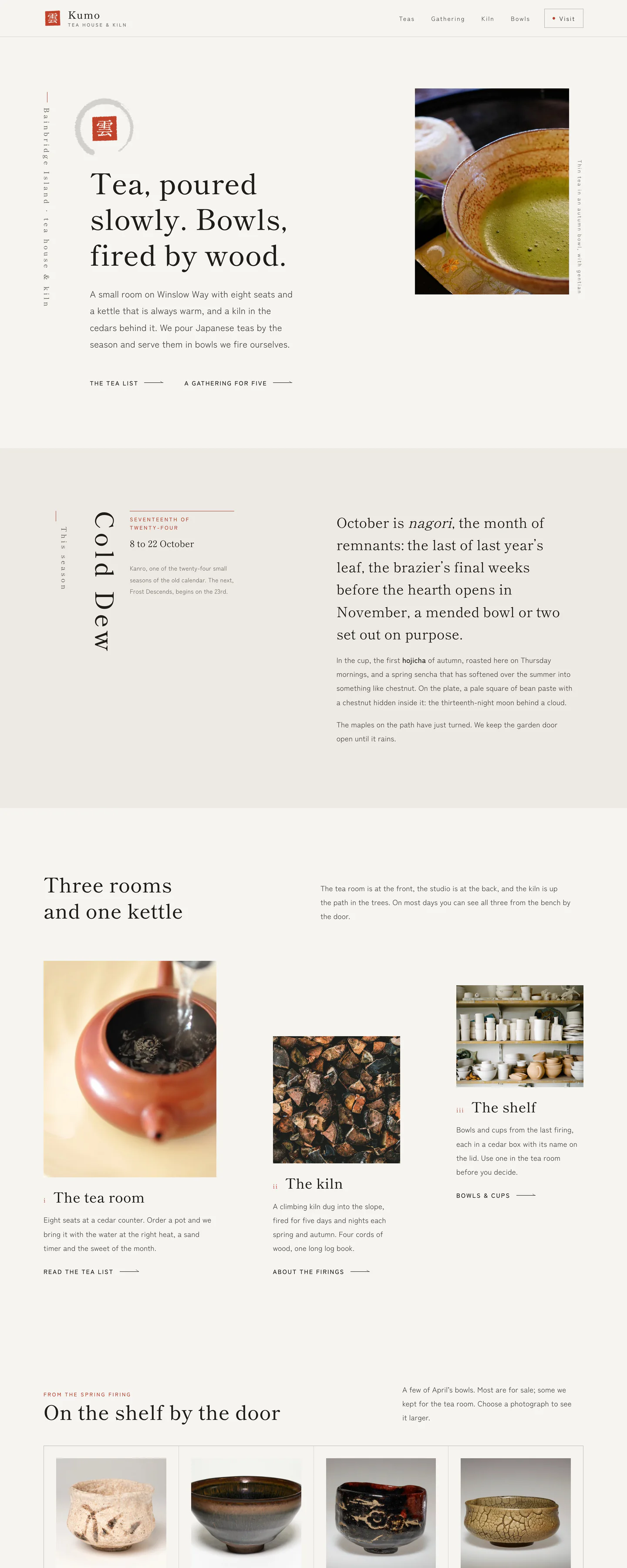
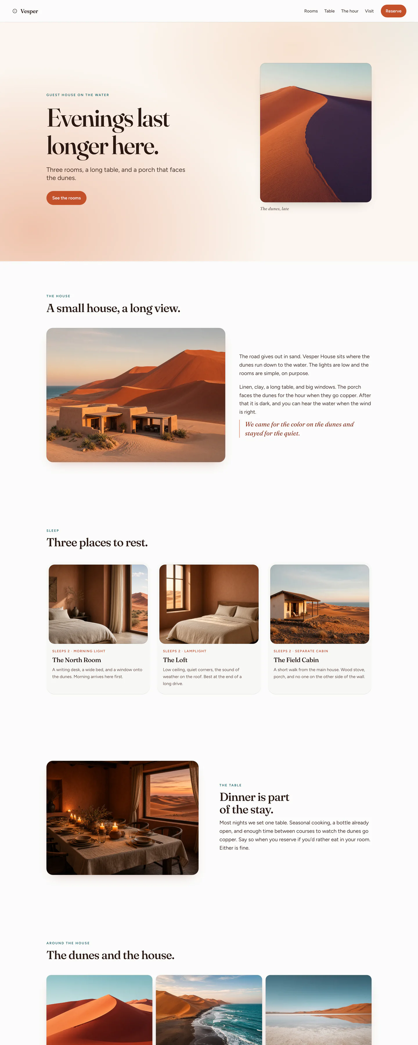
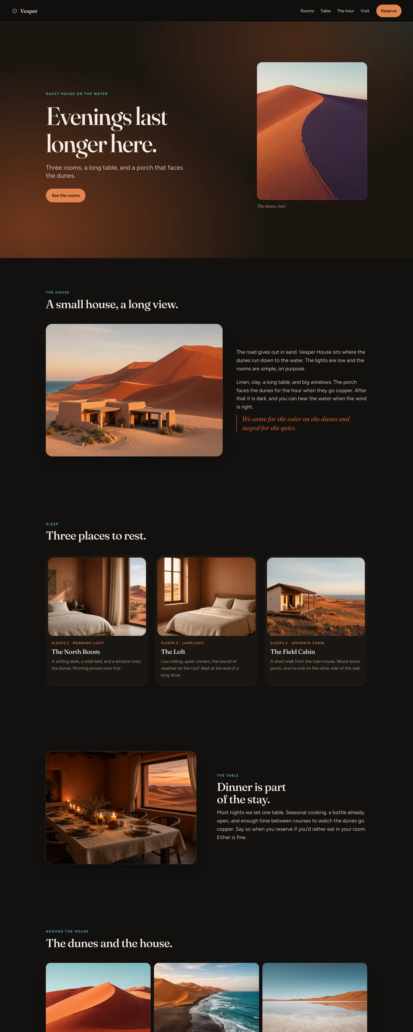
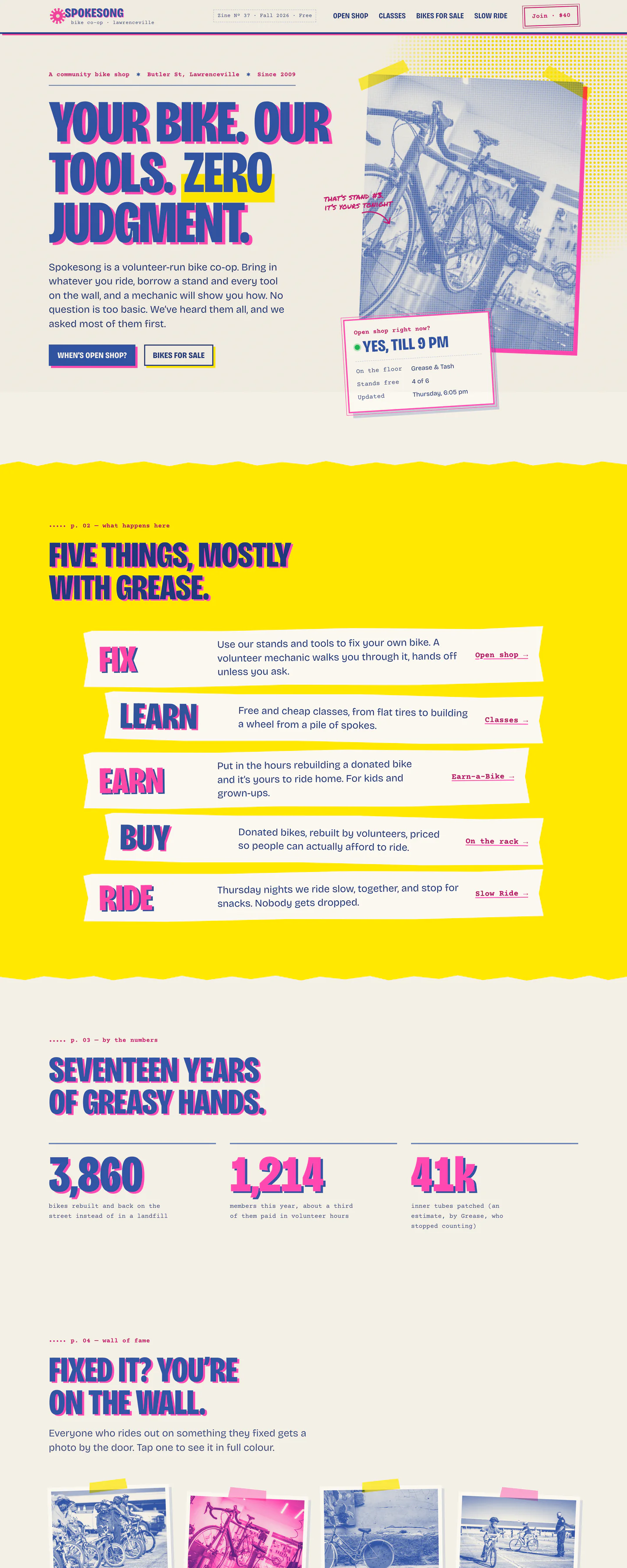
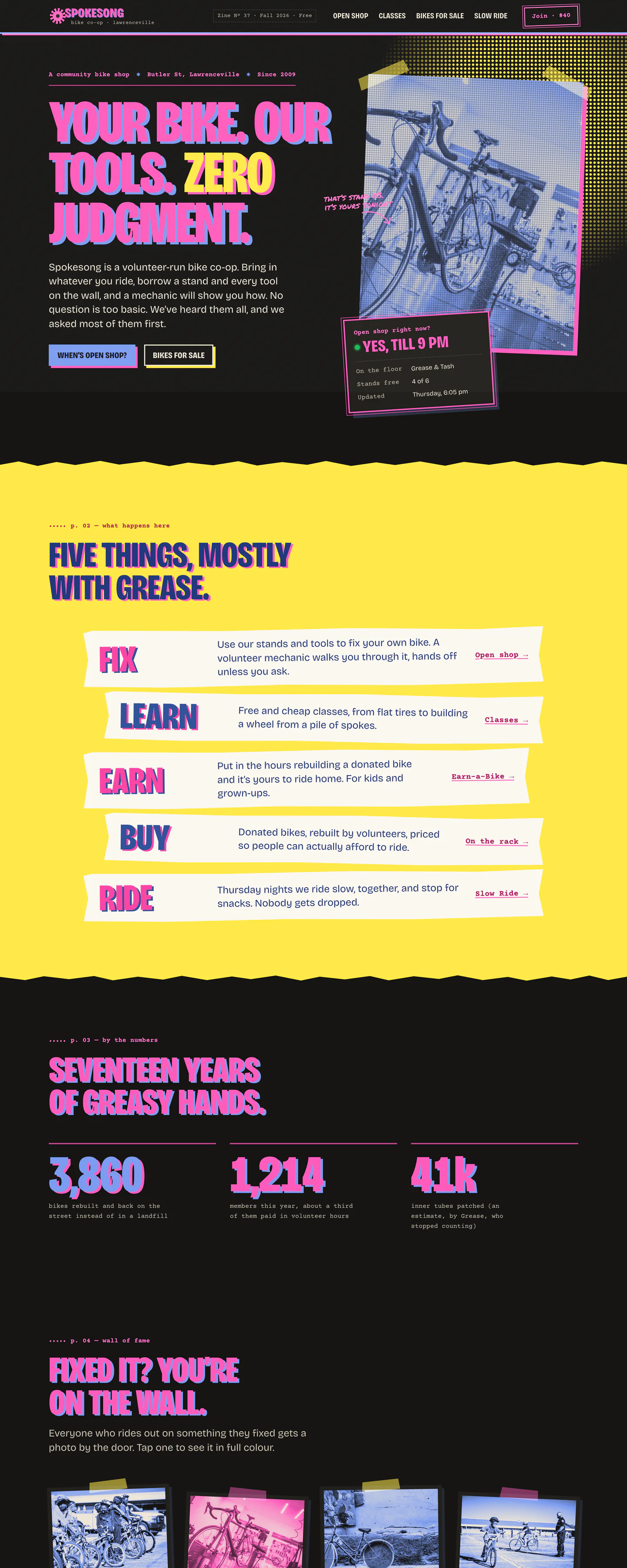
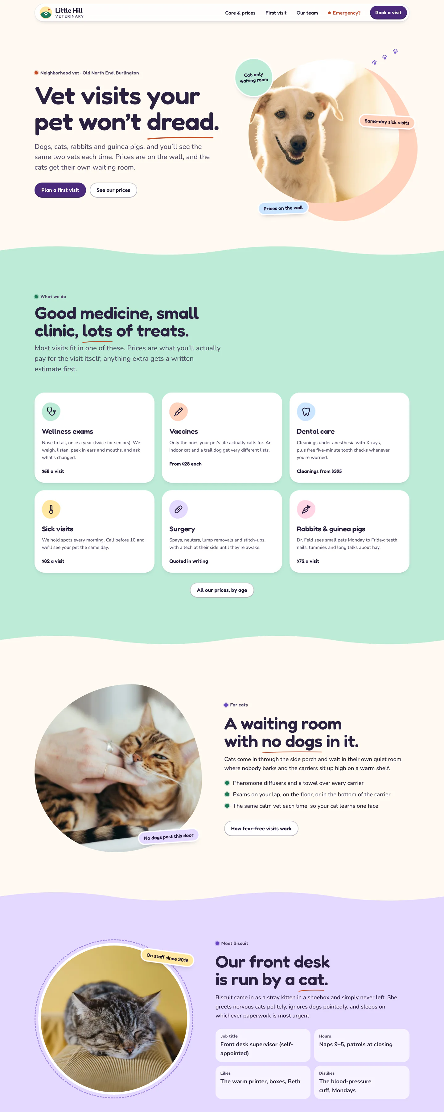
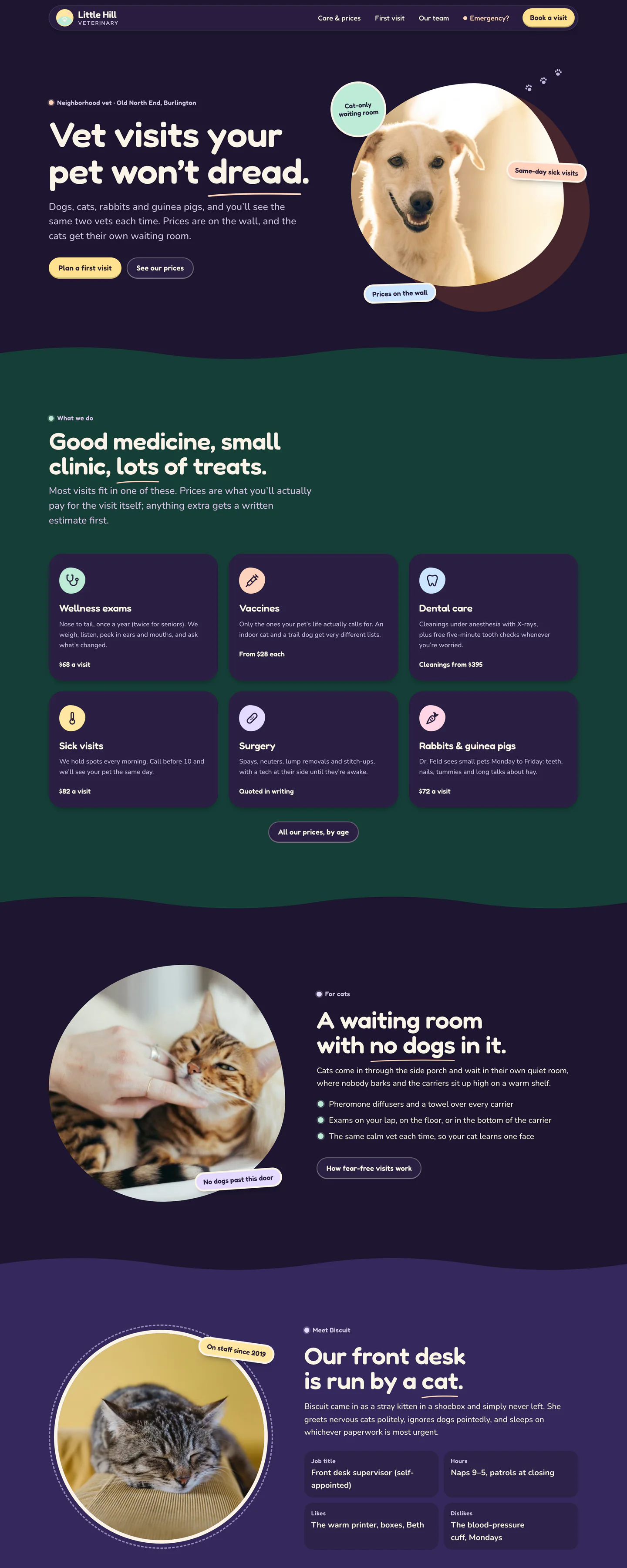
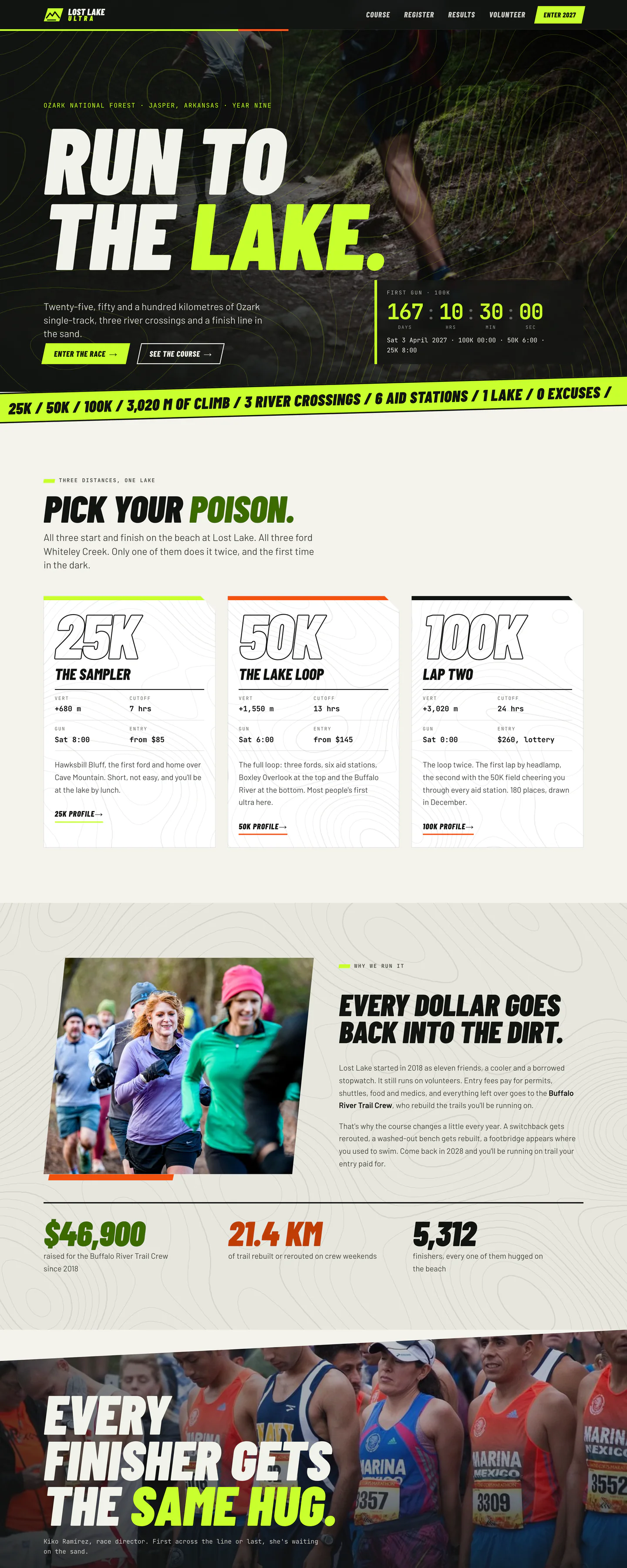
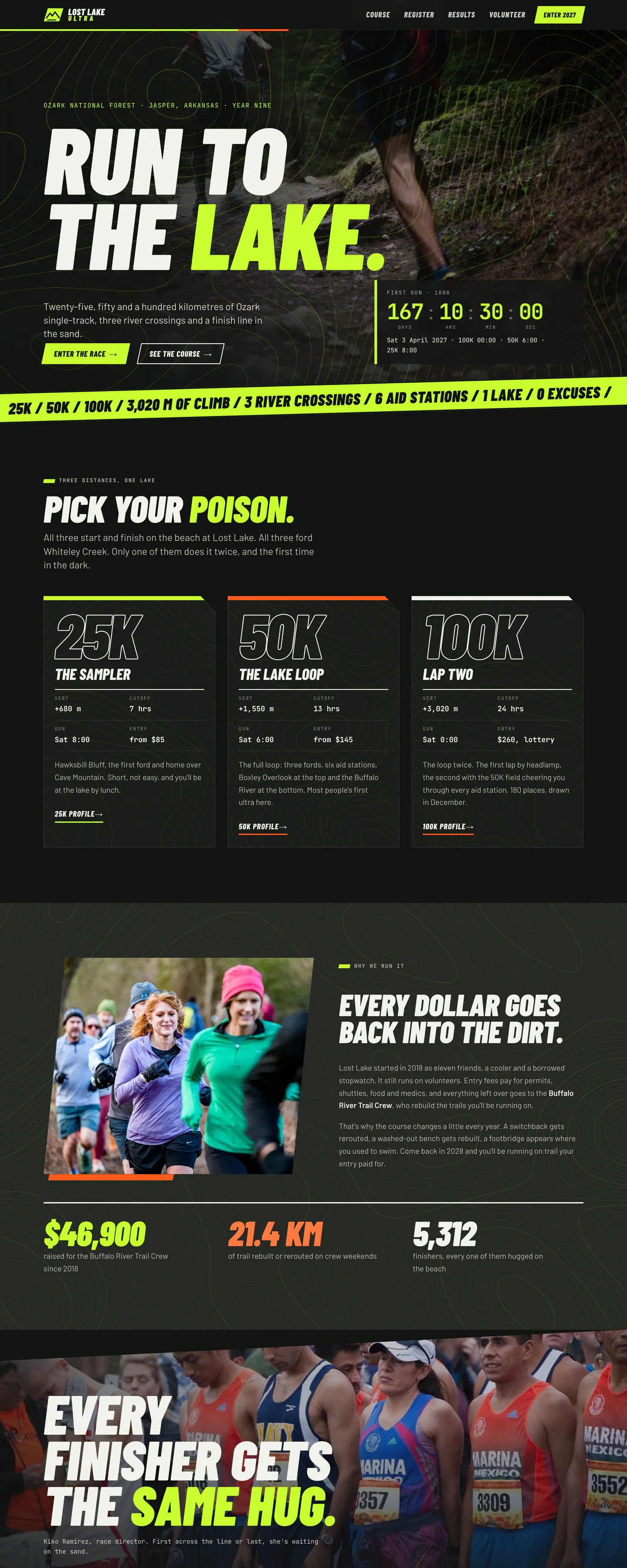
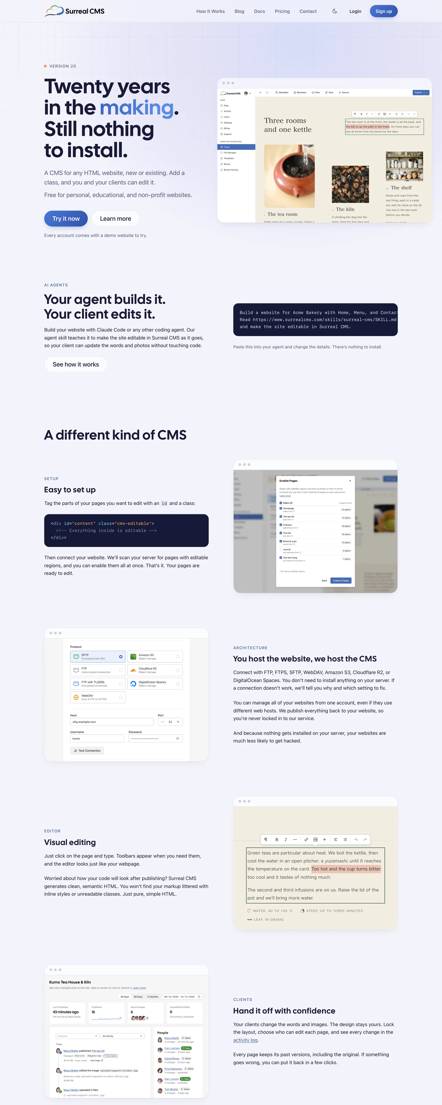
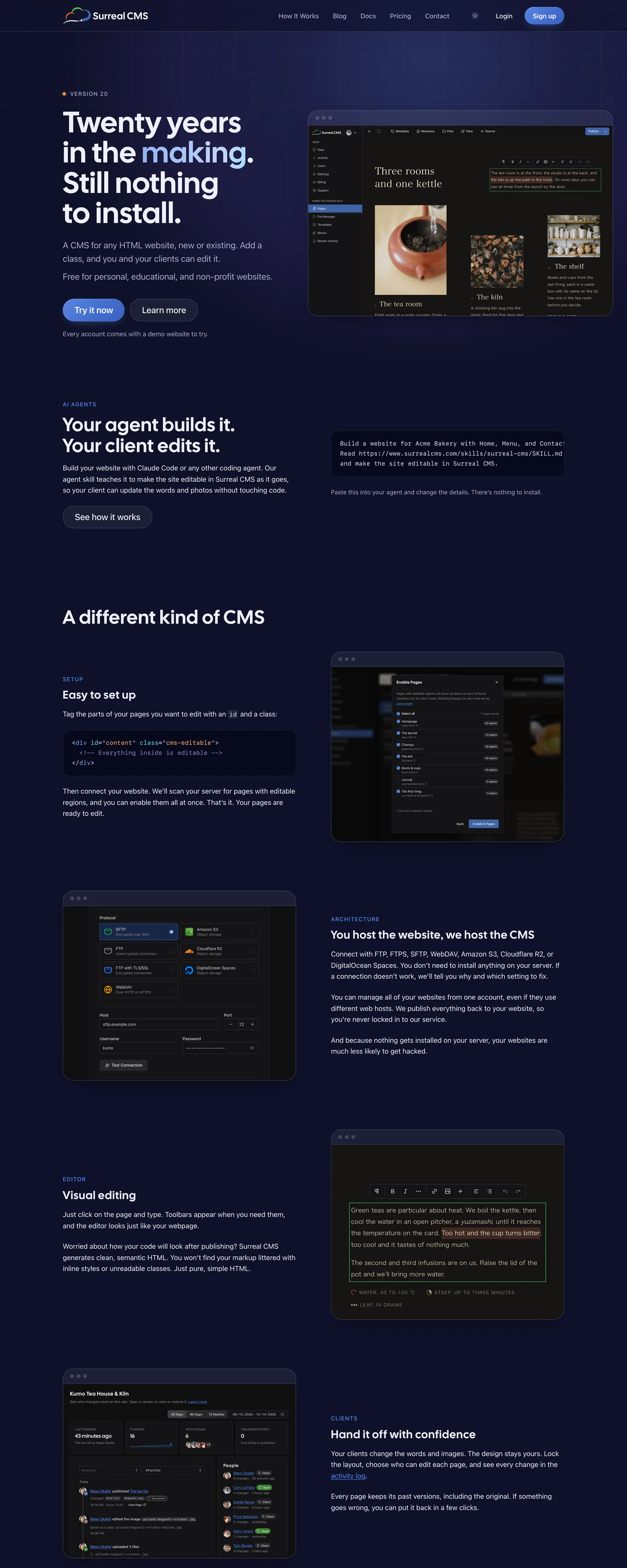
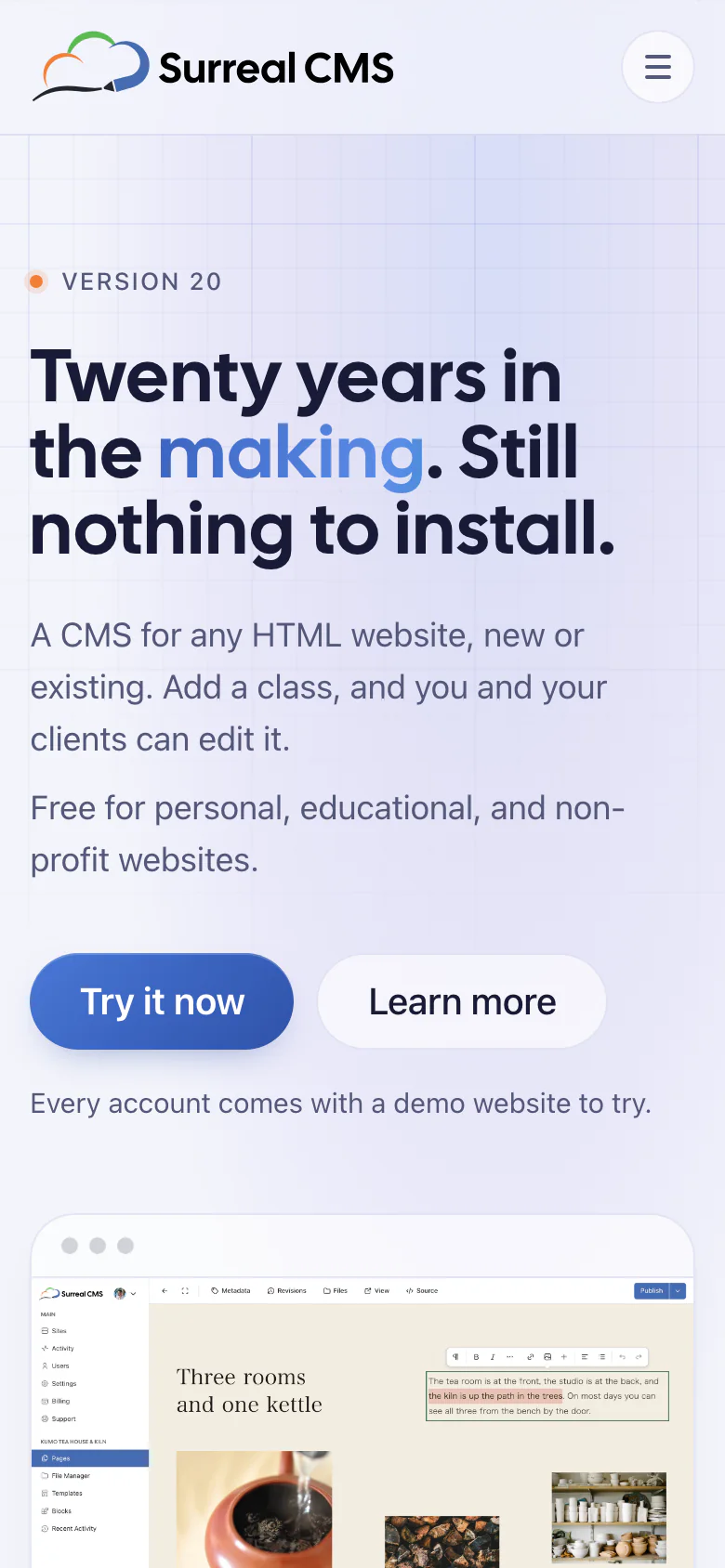
Surreal CMS is our own product, and it's been running since 2008. We wanted the redesign to feel like the app: calm, and always clear about what to do next. Every page has one bright button, and nothing else gets to compete with it.
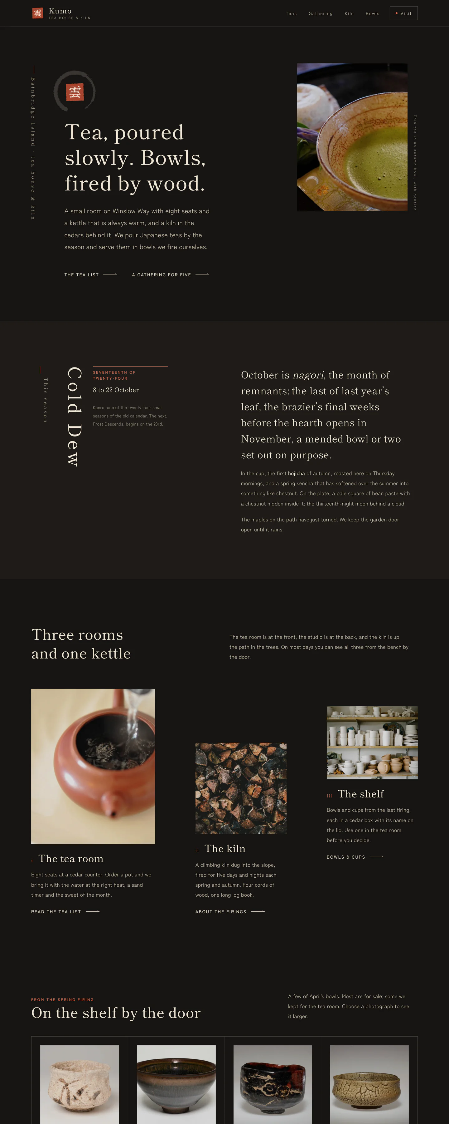
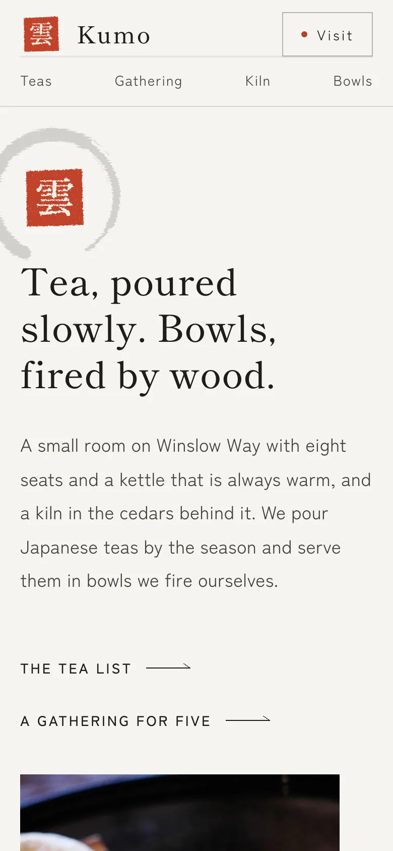
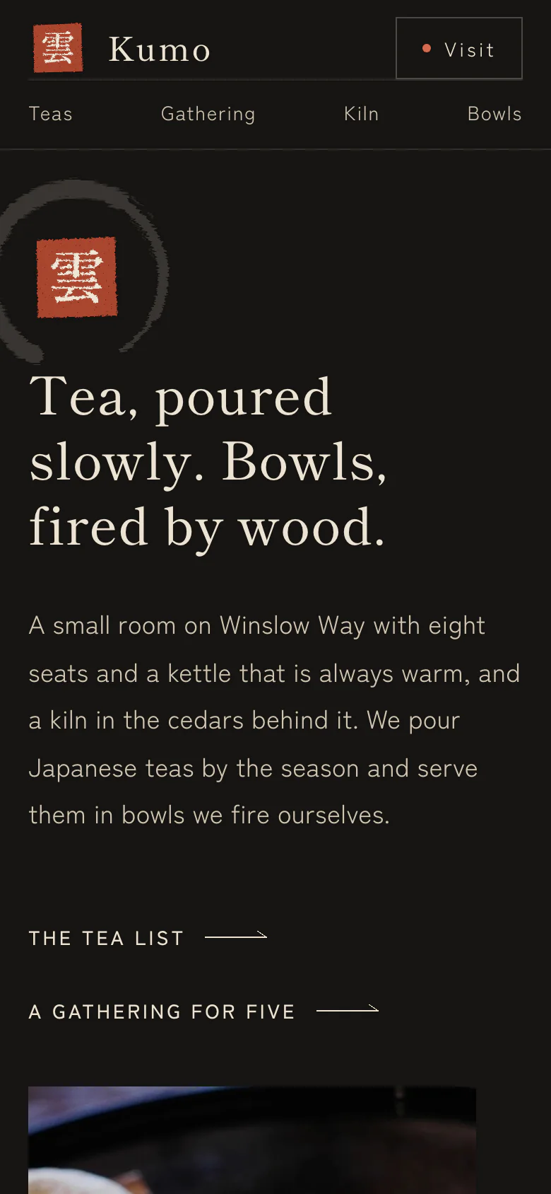
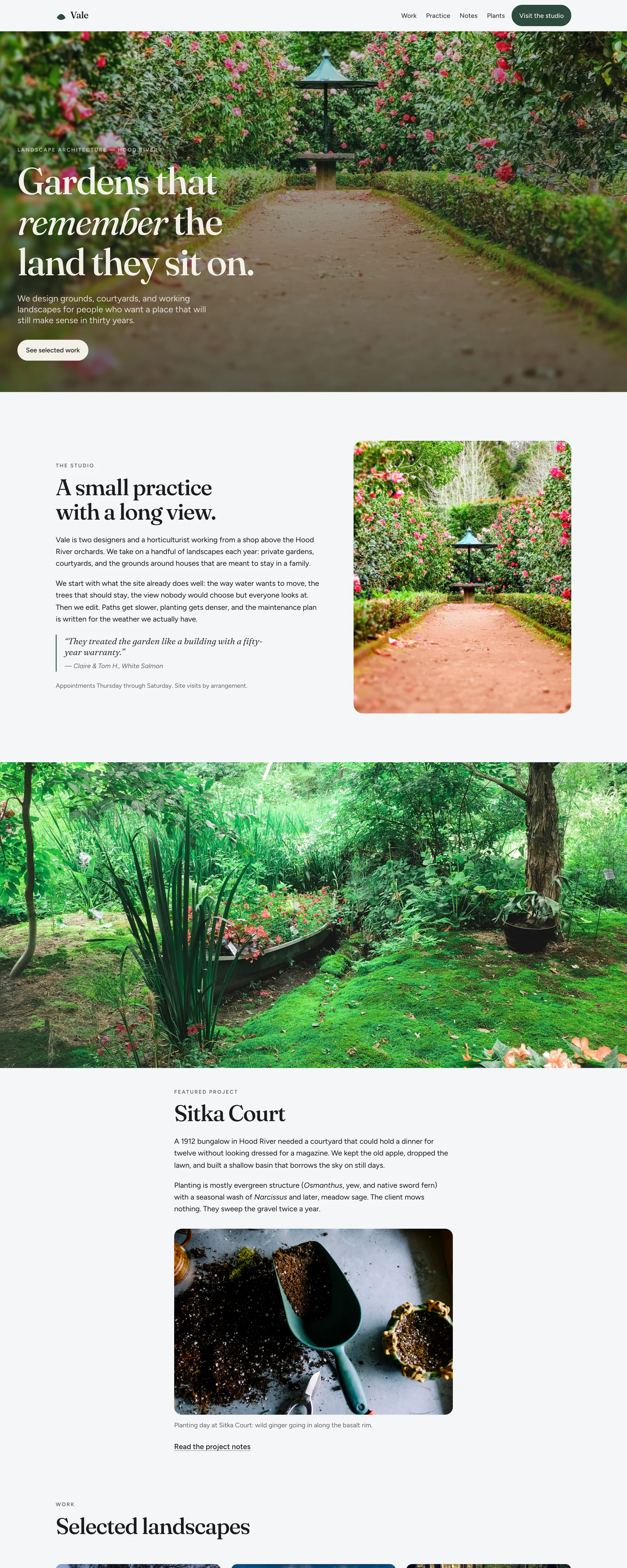
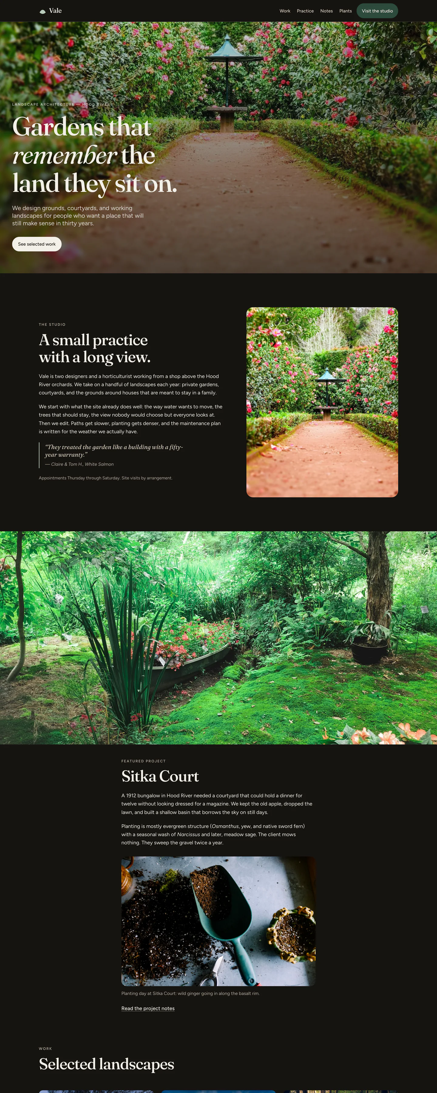
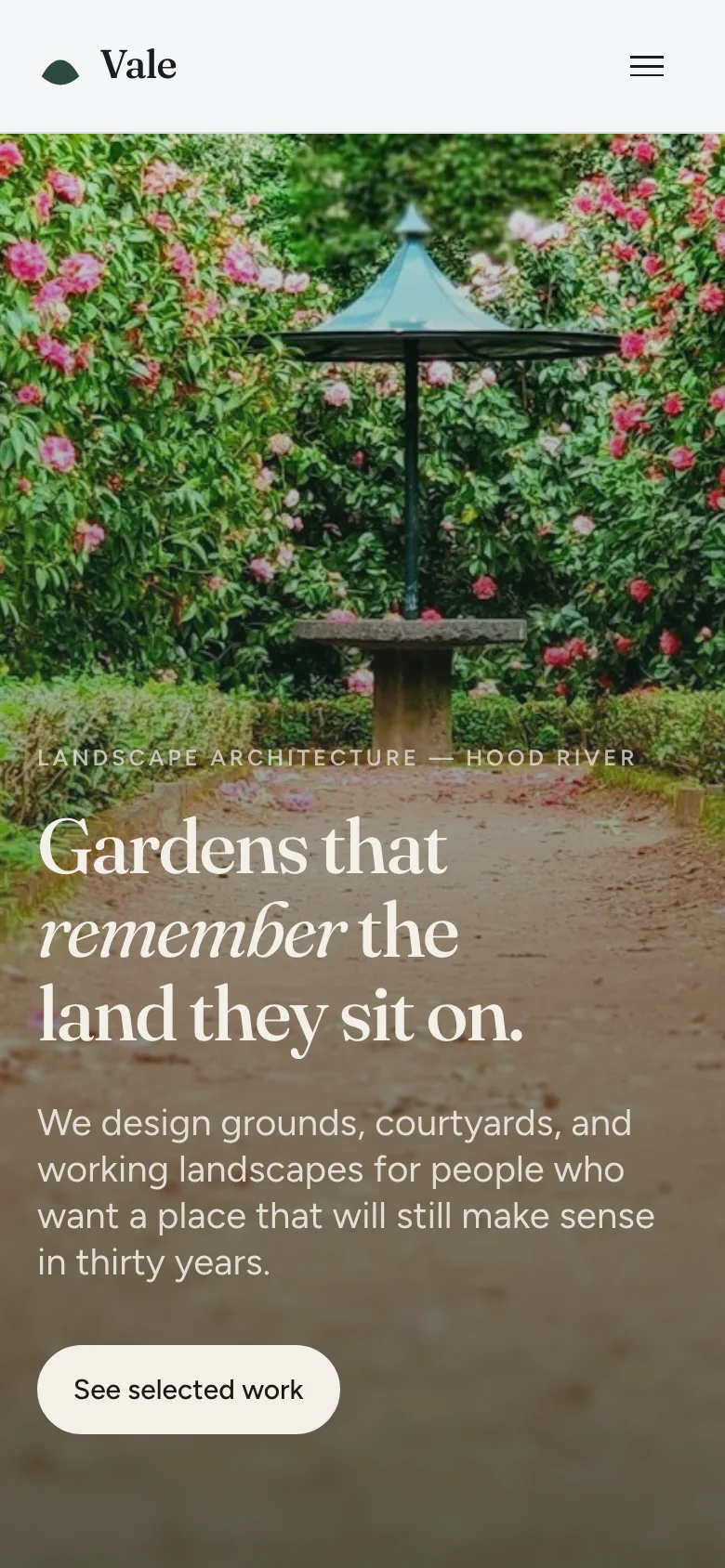
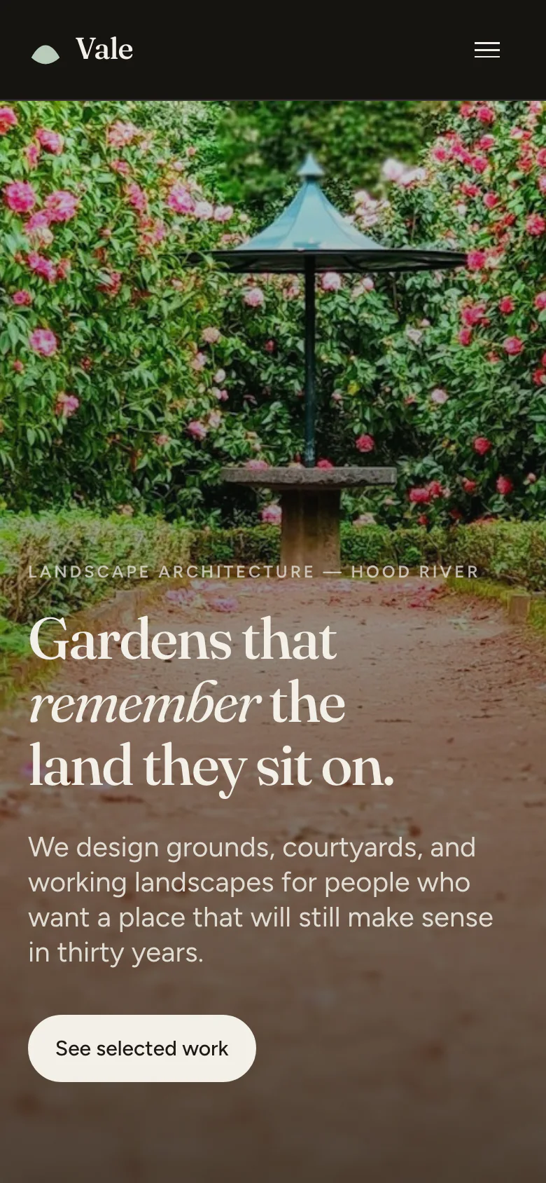
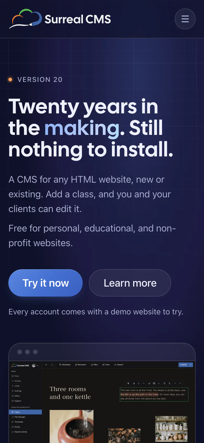
The colors come from the product. The blue is the same one the app is built on, the neutrals lean navy instead of gray, and the logo's orange only shows up where something needs pointing at. Light mode has a soft periwinkle wash. On deep navy in dark mode, the button gets a little brighter so it still wins.
Look closely at the editor in the hero. That's Kumo, the tea house at the top of this page.
- Type
-
- Cal Sans for headlines, big numbers, and the wordmark
- System UI for everything else, so the site matches the app
- Palette
-
- Paper
- Ink
- Blue
- Orange
- Mist