

CSS drop caps
Heads up! This post was written in 2007, so it may contain information that is no longer accurate. I keep posts like this around for historical purposes and to prevent link rot, so please keep this in mind as you're reading.
— Cory
Traditionally found in printed media, drop caps are created by emphasizing the size, color, weight, or style of the first letter in the first sentence of a paragraph. We can easily reproduce this effect on webpages by using the :first-letter pseudo element.
Writing the styles
Let's start by creating a class called drop-cap and adding a bit of style to it:
.drop-cap:first-letter {
  float: left;
  font-size: 4em;
  line-height: 1;
  margin: .125em .25em;
}
As you can see, the size of the first letter will be significantly larger then the rest of the text. A typical drop cap will line up with the top of the first line of text and the left margin of the paragraph. Horizonal alignment occurs naturally, but we need to account for vertical alignment. By default, it appears slightly higher than we want it to, so the margin-top attribute offsets it enough to get it in line. Depending on font size and unit, this number will vary.
You'll also notice that the first-letter is floated. This allows the letter to sink into the text instead of remaining inline.
Applying the class
Now that we've created the CSS drop-cap class, it's easy to apply it to any paragraph element:
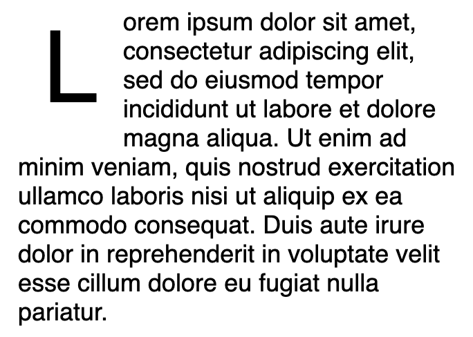
<p class="drop-cap">
  Lorem ipsum dolor sit amet, consectetur adipiscing elit, sed do eiusmod
  tempor incididunt ut labore et dolore magna aliqua. Ut enim ad minim
  veniam, quis nostrud exercitation ullamco laboris nisi ut aliquip ex ea
  commodo consequat. Duis aute irure dolor in reprehenderit in voluptate
  velit esse cillum dolore eu fugiat nulla pariatur.
</p>
Which produces something like the image above.