

Buttons and Cursors
There's a post from 2016 entitled Buttons shouldn't have a hand cursor that's been making its way around social media this week. While the author is correct in his statement that operating system buttons don't have hand cursors, the pattern has become ubiquitous and somewhat expected on the Web.
Some of his points include:
When a button has the hand cursor, it subtly suggests that the user is interacting with a link when they’re not.
The hand cursor is reserved for links. This is because they are unique in their behaviour.
Links have always been handled this way since the web came along — this is the convention of the web that you need not innovate on.
Admittedly, most of my designs as of late do include cursor: pointer for buttons as well as other clickable, non-link controls. And while I don't have a strong opinion either way, revisiting that post triggered a thought about the psychology behind user interfaces.
Learned Behaviors #
As a computer user, you undoubtedly know what radio buttons are and how they work. But how do you know that? Do you remember the very first time you used one? Probably not, but it's likely that your first experience created a pathway in your brain that said "I can only pick one of these" and that knowledge has been engrained ever since.
These are learned behaviors. A child who has never seen a radio button before might try to click on one to make a choice. Then they might click on another one to select a second choice. Quickly, the child will realize the limitations of a radio button: "I can only pick one."
That lesson remains with them until something challenges the pattern, and when such change occurs, they will dislike it because it doesn't feel correct to them. It's suddenly "unintuitive" because they've learned to expect certain behaviors, and anything unfamiliar will be called out as "poor design."
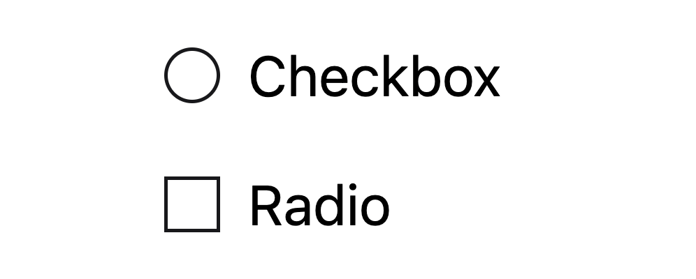
This is why radio buttons are almost always round and checkboxes are almost always square. Swapping something as simple as the shape of these controls will confuse users because it contradicts their learned behaviors.
How We Got Here #
If users develop such intrinsic expectations for consistent UIs, then how did the proliferation of hand cursors on buttons even occur? A theory I have dates back to the "Web 2.0" trend where buttons got bigger, more colorful, and eventually a lot flatter. When buttons stopped looking like buttons, designers threw in a subtle way to more easily distinguish them by changing the cursor.
Plenty of users complained about flat design, but I believe the trend is directly related to why almost every button on the Web today has a "link cursor." It was a subtle enough change — an improvement, if you will — that made flatter controls more tolerable. Web designers slipped the pattern in and, while everyone was busy complaining about the lack of skeuomorphism and increasingly harder-to-identify buttons, nobody really noticed.
Now that nearly every clickable thing on the web seems to have a hand cursor, I'd argue that not doing it is the new anti-pattern, largely due to user expectations. The Web isn't an operating system and, despite the obvious inconsistency between operating system and Web interfaces, nobody seems to care.*
In some ways, I wonder if this hurts the web. Those of us who would love to see Web-based technologies compete more with native apps could easily argue that Web apps should behave the same way to make them as indistinguishable as possible, but I seldom hear about this particular inconsistency in the wild.
I wonder if anyone would even notice if we suddenly removed the hand cursor from all of our buttons. My guess is that few would, especially now that touch devices are more prominent for consumers. The handful of people who would notice are those that aren't browsing on iPhones and iPads, but "regular" computer users who, arguably, aren't so regular anymore.
*Admittedly, I don't have a strong preference here. I rarely think about it, although the thought does cross my mind from time to time. I tend to side with my users' expectations and, given the ubiquity of hand cursors on the Web, I'll continue to change the cursor on buttons until there's a good reason to stop.